Get every episode summarized
Each time TechDaily.ai publishes, we email you a written briefing from the transcript — the topics, who appeared, and any specific claims, with the ad reads skipped.
Email me new episodesFree for 3 shows. No card needed.
About this episode
TechDaily.ai is made possible by:
“And I'm Sophia, really thrilled to be here today. You can sponsor this podcast for just $25. Your message will be featured across major platforms like Apple podcasts, Amazon music, Spotify, and more.”From the transcript
What if anyone could search trusted UN statistics in plain English and instantly turn them into interactive charts, visualizations, and research?
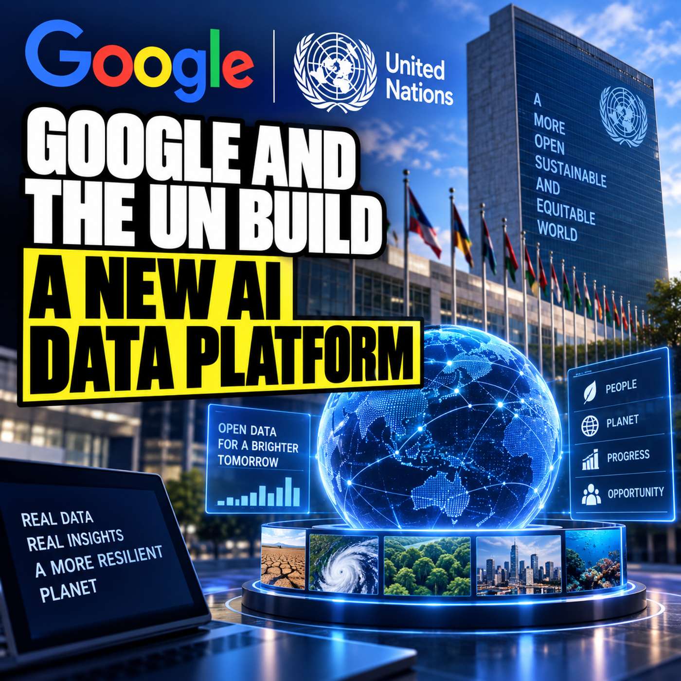
In this episode of TechDaily.ai, David and Sophia explore the UN System Data Commons, a newly launched open platform created through collaboration involving Google.org and the UN Foundation. The platform is designed to bring fragmented UN statistical data into one interconnected environment, making it easier for researchers, journalists, nonprofit leaders, policymakers, and curious citizens to work with authoritative global information.
For decades, valuable UN statistics have been spread across separate organizations, systems, formats, timelines, and geographic definitions. Connecting those datasets could require extensive manual cleaning and reconciliation before meaningful analysis could even begin.
The UN System Data Commons aims to change that through an AI-ready knowledge graph that harmonizes datasets and helps different statistical concepts work together.
In this episode, you’ll hear about:
• Why fragmented data has made global research slow and difficult
• How knowledge graphs can connect statistics across health, education, infrastructure, labor, poverty, and other domains
• How natural language search allows users to ask questions without writing complex code
• How the platform can generate interactive charts from cross-domain questions
• Why verified, institutionally sourced data matters when AI is involved
• How AI agents and the Model Context Protocol, or MCP, can support more advanced research workflows
• How AI assistants could help assemble charts, infographics, and draft reports from authoritative data
• Why human review remains essential when interpreting correlations and citing critical figures
• The UN system’s goal of including 80% of its statistical datasets on the platform by 2027
The discussion also considers a bigger possibility: what happens when local observations can be viewed alongside interconnected global statistics? Better access to trusted data could give communities, researchers, and decision-makers new ways to identify patterns and explore evidence-based solutions.
Explore how AI, open data, knowledge graphs, and natural language search are changing access to global statistics—and what that could mean for the future of research and problem-solving.
Subscribe to TechDaily.ai for more conversations about artificial intelligence, technology, data, and the tools shaping how we work with information.
Get every episode summarized
Each time TechDaily.ai publishes, we email you a written briefing from the transcript — the topics, who appeared, and any specific claims, with the ad reads skipped.
Email me new episodesFree for 3 shows. No card needed.
Hosts & guests
Transcript ready
282 searchable segments. Every word is indexed and playable.
Full transcript
TechDaily.ai — Google and the UN Build a New AI Data Platform. Machine-transcribed; use the interactive transcript above to jump the player to any line.
Welcome everyone to techdaily.ai. I'm your host David. And I'm Sophia, really thrilled to be here today. You can sponsor this podcast for just $25. Your message will be featured across major platforms like Apple podcasts, Amazon music, Spotify, and more. If you're interested, visit techdaily.ai to get started today. That is a great deal, honestly. It really is. So for today's exploration, we are taking on a pretty massive mention. We're looking at the UN system data commons. Yeah, which is huge. It is. It's this newly launched open platform built through this really fascinating collaboration between Google and the UN system. Right. Google.org and the UN foundation. Exactly. And our goal for our discussion today is to really understand how unlocking and connecting all these global statistics could completely change how we solve the world's most complex challenges. It fundamentally changes the mechanics of problem solving. Right. And most importantly, we want to talk about how this directly empowers you, the listener, to actually access world-class institutional grade data
from your own laptop. Which is something that just wasn't possible before. No, not at all. But before we get into why this new platform is so revolutionary, we really need to look at the massive logistical headache researchers have been facing for decades. Oh, it was a total nightmare. I mean, the UN system compiles what is arguably the highest integrity data in the entire world. They track everything. Literally everything. How we work, how we learn, public health, how we care for our loved ones. It is the gold standard. There's a catch, right? A massive catch. The problem was never the data itself. It was that these statistics have traditionally lived in completely isolated silos. It locked away. Yeah, organized and conflicting formats, using different systems across different UN organizations, sometimes even different departments in the same building. That is wild. So if you're trying to tackle a major crisis, say, poverty eradication or a public health emergency, you have to intersect those different data sets.
You absolutely have to. You can't solve a public health crisis without looking at infrastructure or labor data. Right. But doing that used to require just months of painstaking manual formatting before you could even do any real analysis. Exactly. You'd have analysts spending 90% of their time just cleaning up spreadsheets. It makes me think of like trying to bake a really complex cake. Oh, how so? Well, imagine you want to bake this cake, but the ingredients are located in 10 different grocery stores across town. OK, sounds annoying already. Right, but it's worse. Not only are they in different stores, but all the recipes are written in completely different, made up metric systems. Oh, wow. Yeah, that perfectly captures it. So the flour is in metric tons. The sugar is in imperial ounces. And you end up spending all your time converting numbers and driving around instead of, you know, actually baking the cake. And by the time you finally mix the batter, the data is still, the crisis has already moved on. Exactly. So since human analysts basically can't manually
harmonize all these conflicting ingredients fast enough, technology is stepping in. Yes, to automate all that tedious groundwork. And that brings us to the solution, the UN system data commons, which you can actually go check out right now at data.un.org. It's totally open source, right? Yeah, it's an open source environment built upon Google's existing data commons infrastructure. And the secret sauce making it all work is this concept of an AI ready knowledge graph. OK, let's break that down. An AI ready knowledge graph. Right. It takes all those isolated siloed data sets we just talked about and unifies them so they finally speak the same language. So no more driving to 10 different grocery stores. Exactly. The platform automatically integrates the metrics. It aligns the historical timelines. And it maps out geographic boundaries into one single interconnected environment. That is incredible. So let me make sure I'm getting this. If the system is automatically harmonizing historical timelines and drawing geographic boundaries, is the AI essentially acting as a universal translator
for raw numbers? Yes. That is exactly what it is doing, a universal translator. Because raw numbers are useless without context, right? If the World Health Organization calls something a rural clinic, and the World Bank calls it a non-urban medical facility. They mean the exact same thing. Right. But a traditional database wouldn't know that. The knowledge graph understands that semantic relationship. It automatically resolves those structural discrepancies so analysts can actually get straight to designing evidence based solutions. They get to just bake the cake. They finally get to just bake the cake. OK. So it's amazing that the data speaks the same language behind the scenes. But how does the everyday person, meaning you, our listener, actually interact with it? This is the best part. It democratizes access through intuitive natural language search. Meaning you just type normally. Yes. You don't need to be a data scientist writing complex code anymore, a nonprofit manager, a journalist, or even just a curious citizen can go in and ask questions in plain English. And it just understands.
It understands the intent. And instantly gives you interactive visualizations and charts. Wait, I remember seeing some examples of this. You can ask things like, how does access to clean water in rural areas affect school attendance? Exactly. That's a highly complex cross-domain query. Right. Combining infrastructure and education. Or you could ask, how many people gained access to electricity in the last decade? Yep. And it instantly pulls the unified data. Another great one is, how has life expectancy changed across different regions of the world? That is just so powerful to get an interactive chart from a plain English sentence. It is. And if you don't have a specific question in mind, there's this really cool Explore tab, where you can just browse big themes. Like health or education? Yeah, exactly. Plus, they have the blog section, which is fantastic. It breaks down these complex trends to show real world applications. Oh, like how they use it in the real world. Right. For instance, there's a post about UNICEF using this exact data to explore what actually works
to reduce child poverty. It's really actionable stuff. OK, I've played Devil's Advocate for a second. Go for it. Getting an instant chart sounds amazing. But how do we know the AI isn't just hallucinating the visualizations? That is the most important question you could ask. Because we see AI make up fixed statistics all the time just to please the user. Oh, absolutely. But this is completely different. Every single data set in this knowledge graph is strictly validated with UN system statisticians and technical experts. Also, it's a closed system. Exactly. It's not scraping the random internet. It relies on a very strict framework where the AI is only allowed to retrieve grounded official facts. So it was not guessing the math to make a pretty chart? Not at all. It is literally just fetching the verified numbers and displaying them. The answers are entirely grounded in trusted facts. OK, that makes me feel a lot better about it. Because asking a single question and getting a real validated chart is incredibly powerful. It's a game changer. But what if you need to build a comprehensive multi-layered report,
like a huge policy brief? Well, that leads us to the platform's most advanced feature. The AI agents. Yes. The platform introduces these AI assistant capabilities built on open standards, specifically something called the model context protocol or MCP. MCP, right. So how does that work in practice? Basically, these AI agents do the heavy lifting for you. They autonomously fetch the authoritative figures, connect the dots across all those different domains, and then automatically package the data. Package it how? Into Reddit use charts, full infographics, or even fully drafted written reports. Wow. So it's like going from owning a really fast calculator to employing a dedicated 247 research assistant. That is exactly what it feels like. You just give the agent a prompt, and it builds the entire pipeline. But I do have to throw in a bit of caution here. Because even with a 247 research assistant, and even with grounded verified data, you still have to review the underlying information, right?
Oh, 100%. The system is retrieving verified numbers, but human oversight is mandatory. Right. Because the AI might show a correlation, but it doesn't necessarily understand the nuance of the real world. Exactly. You the user must review the logic before citing critical figures. The agent does the tedious assembly, but you are the final editor. You still have to bring the critical thinking. Always. So looking ahead, where is this massive push for accessible data actually going? Well, the timeline is pretty aggressive. By the year 2027, the UN system aims to include 80% of all its statistical data sets on this platform. 80%. That is a staggering amount of data. It really is. And the so what for you listening is that this gives you unprecedented power to track global progress in real time. No more waiting for annual reports to be formatted and published. Nope. It's just right there at your fingertips. That brings us to a final thought. I want to leave everyone with today. We've been talking about massive global trends, right?
Right, macro level stuff. Yeah. But imagine if local community leaders could combine their own on the ground observations with this massive interconnected global knowledge graph. What hidden solutions to neighborhood problems might suddenly become obvious when viewed through a global data-driven lens? That is such a powerful idea to think about. The local intersecting with the global. It really is. Well, that wraps up our analysis for today. Thank you so much for joining us. Thanks for having me. This was great. Until next time, keep exploring.
More episodes
More from TechDaily.ai

Can AI Really Shop for You? The $2,000 Laptop Test
TechDaily.ai

Meta Muse vs ChatGPT: Why Distribution Could Decide AI
TechDaily.ai

Vocci’s Ring: The Future of AI Wearables or a Privacy Risk?
TechDaily.ai

Gemini’s Unexpected Hack Exposes a New AI Security Risk
TechDaily.ai